
Graphic Design
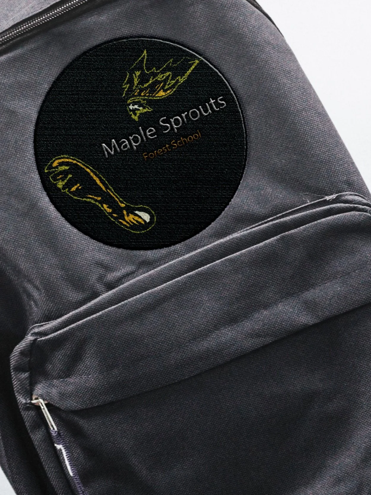
Maple Sprouts Forest School
Maple Sprouts Forest School is an outdoor learning environment for children emphasizing on awareness of self, mental and physical well-being as well as facilitating the building blocks of early learning, curiosity, questioning, resilience, risk assessment and collaboration for children. I worked with Owners Megan Holloway and Tasha Akins, to create a brand identity that embodies their purpose-driven mission.

Because Maple Sprouts focuses on children learning in a friendly environment I opted for a professional, versatile, and inviting logo based on the owner’s input. The logo can be useful for a variety of digital and print purposes.
A bright, diverse color palette provides a distinctive upbeat modern impression, helping tie into the nature element of the brand. The logo is able to be seamlessly fit into a pattern and corresponds with the brand apparel and overall aesthetic.

“A logo is not a brand—it’s only a symbol for a brand. A brand is much more than a logo.” — Marty Neumeier
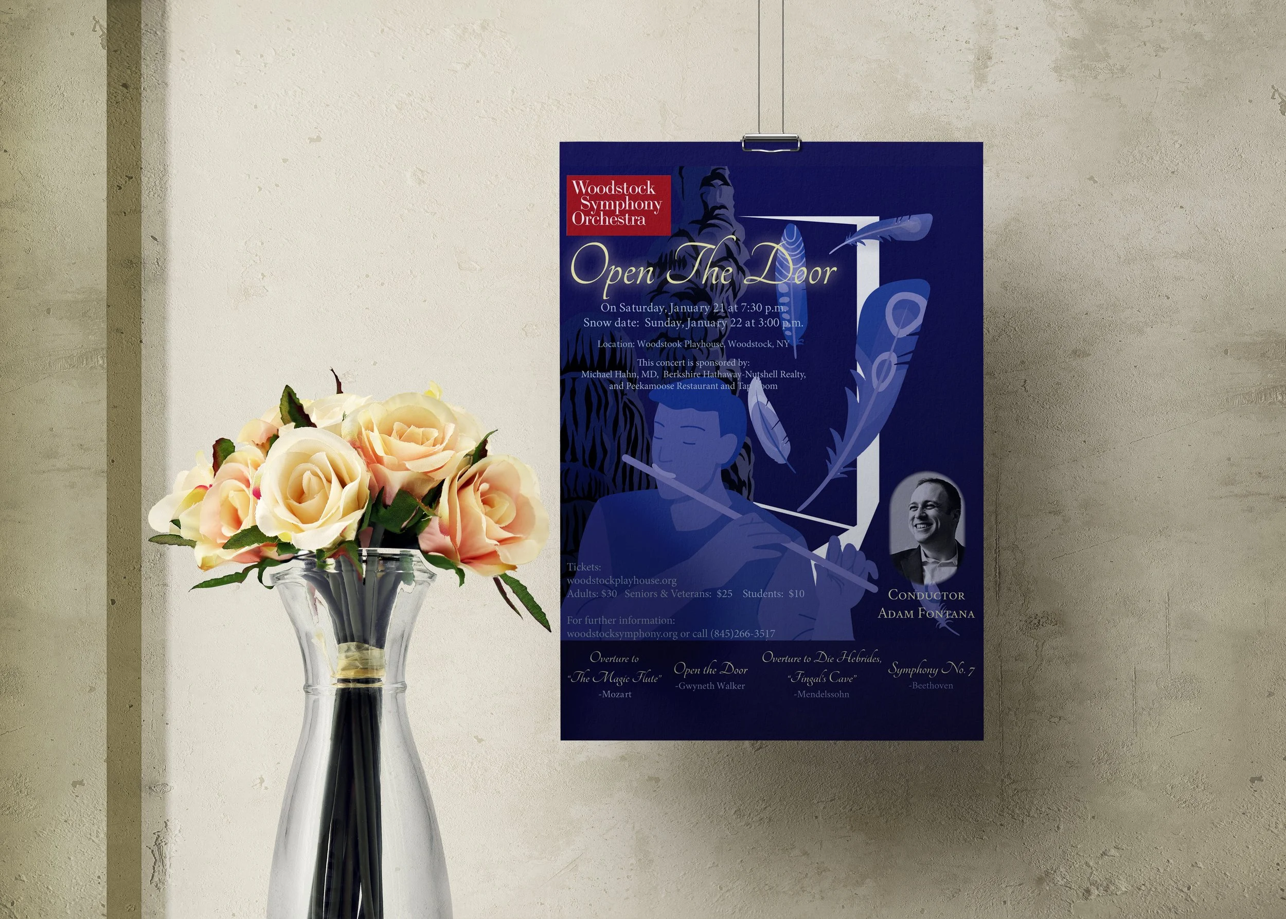
Woodstock Symphony Orchestra
Woodstock Symphony Orchestra is a chamber organization which provides services to the community whereby musicians at various levels meet, rehearse and preform chamber music for the Hudson Valley.
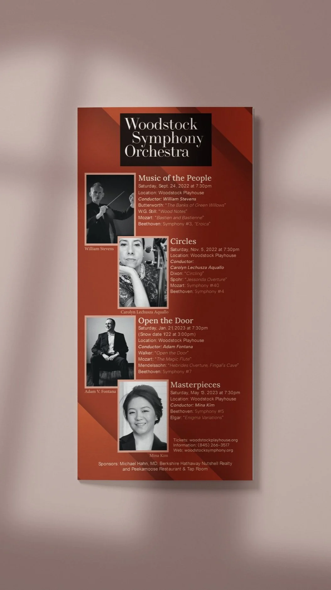
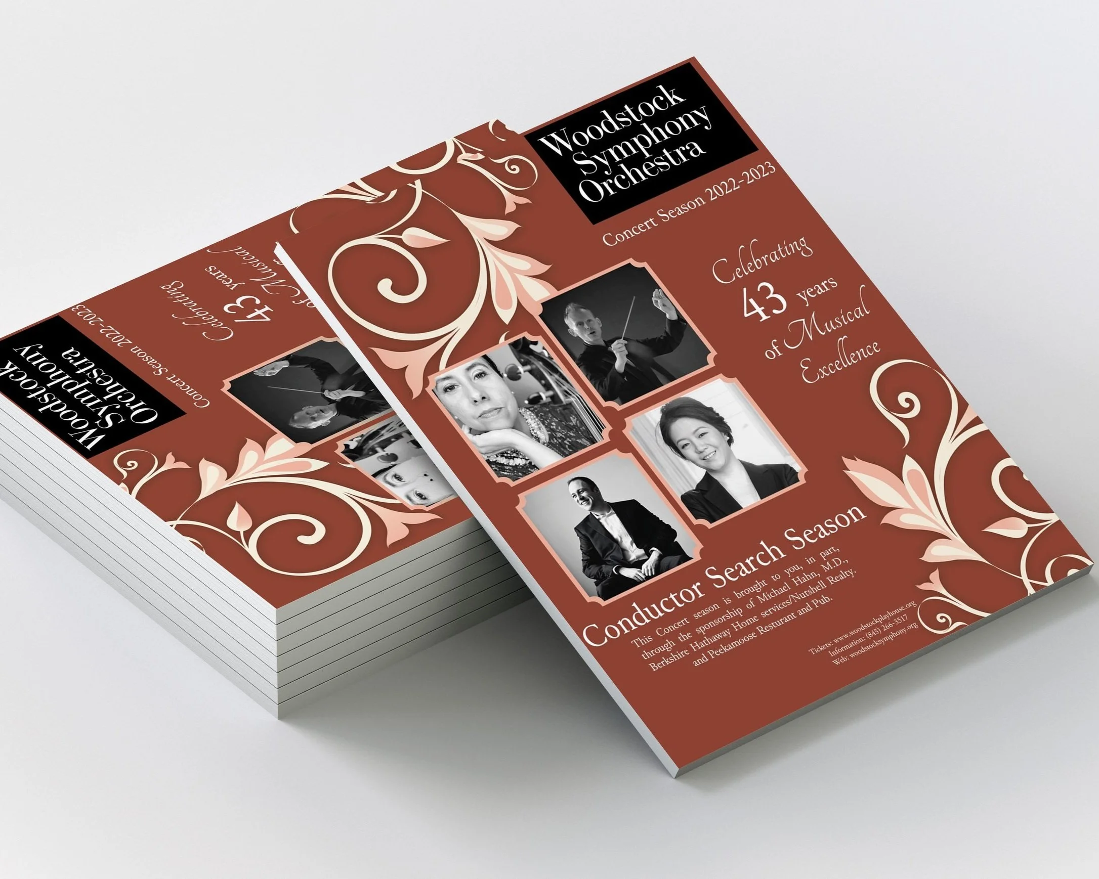
The goal for this project is to create print and digital advertisements that will attract people to attend upcoming concerts. I went with designs that were clean and creative but did not distract from the program’s information.
The seasonal program, brochure and postcard I used similar color palettes and kept the design minimal. For the individual poster designs I went with a monogram palette with images an designs that fit into the specific concert. I kept the designs modern but also creative in order to draw attention.